



NFL Team Logos Tier List: All 32 Ranked
Thirty-two logos, one brutal ranking. Some of these are so good they're basically American iconography at this point. Others look like they were finished five minutes before a deadline and never touched again.
We went through all 32 current NFL logos and sorted them by design quality: how clean they are, how well they work as a symbol, how much they've earned their place in sports culture. This leans on what fans and designers tend to agree on across forums and rebrand debates, with our own calls where the arguments get heated.
Disagree with where your team landed? That's half the fun. Argue it out, then make your own list.
The tier list
The community’s tier list fills in as members vote. It appears once 5 members have ranked or voted on these (1 so far).
Think you can rank them better?
Make your own tier listFree account. Your ranking stays private unless you share it, and it counts toward the community tier list.Vote
SS Tier: Hall of Fame logos
Pittsburgh Steelers
The Steelmark logo is one of the few NFL marks that isn't even football-specific, it was borrowed from the American Iron and Steel Institute, and it works perfectly anyway. Only on one side of the helmet, which somehow makes it cooler, not lazier.
About Pittsburgh Steelers
Founded in 1933, the Steelers use the Steelmark logo, originally designed by the American Iron and Steel Institute to promote steel products. It remains one of the only logos in major sports applied to just one side of the helmet.
- Founded
- 1933
- Logo colors
- Gold, red, light blue, black
Green Bay Packers
Just a letter G. That's it. But it's a G with weight, history and a town's entire identity packed into it. Impossible to confuse with anything else.
About Green Bay Packers
The Packers are the oldest continuously operating NFL franchise still in its original city, and their logo is simply an oval with a capital G. It's one of the most recognized single-letter logos in sports.
- Founded
- 1919
- Logo colors
- Green and gold
Dallas Cowboys
A star. A literal, perfect, five-pointed star. It's the platonic ideal of a sports logo: instantly readable from a blimp shot and tattoo-ready for millions of fans.
About Dallas Cowboys
The Cowboys adopted their star logo in the franchise's early years and have kept it essentially unchanged. It's become one of the most tattooed and merchandised logos in American sports.
- Founded
- 1960
- Logo colors
- Navy blue and silver
Las Vegas Raiders
Swords, a shield, a pirate in a football helmet, somehow it all works. The silver and black menace has outlived two city moves without losing an ounce of its edge.
About Las Vegas Raiders
Originally the Oakland Raiders, the franchise moved to Las Vegas in 2020 but kept its shield-and-pirate logo intact. The design combines crossed swords, a shield and a silver-helmeted pirate.
- Founded
- 1960
- Moved to Las Vegas
- 2020
AA Tier: Sharp and proud
Philadelphia Eagles
The current snarling eagle head is sharp, modern and mean in exactly the right way. A big step up from the cartoonish full-body bird of the old days.
About Philadelphia Eagles
The Eagles switched to their current snarling eagle head logo in the early 1990s, moving away from an earlier cartoonish full-body bird design.
- Founded
- 1933
- Logo colors
- Midnight green, silver, black
Denver Broncos
That horse head mid-snort, nostrils flared, mane flying, captures pure aggression in one clean shape. Way better than the bucking bronco it replaced in the 90s.
About Denver Broncos
The Broncos' current snorting horse head logo replaced an earlier bucking bronco design in the 1990s, alongside a shift to a navy and orange color scheme.
- Founded
- 1960
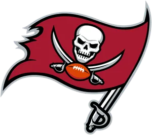
Tampa Bay Buccaneers
Bringing back a version of the skull-and-crossbones flag energy was the right call. Fierce, clean, and finally shed the goofy wink of old Bucco Bruce.
About Tampa Bay Buccaneers
The Buccaneers moved away from their original winking 'Bucco Bruce' pirate logo in the late 1990s for a more aggressive skull-flag design.
- Founded
- 1976
- Logo colors
- Red, pewter, black
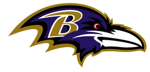
Baltimore Ravens
A raven's head rendered almost like a heraldic crest, purple and black and genuinely regal. Ties directly back to Edgar Allan Poe and the city's literary history, which is a nice touch most fans don't even know about.
About Baltimore Ravens
Named after Edgar Allan Poe's poem 'The Raven,' written while Poe lived in Baltimore, the team's logo features a raven's head in purple and black.
- Founded
- 1996
- Logo colors
- Purple, black, metallic gold
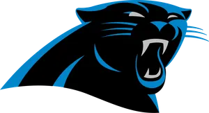
Carolina Panthers
A snarling panther head in sharp black, blue and silver angles. Modern, aggressive, and one of the better expansion-era logos the league has produced.
About Carolina Panthers
An NFL expansion team from the 1990s, the Panthers use a snarling panther head logo rendered in sharp geometric angles.
- Founded
- 1995
- Logo colors
- Panther blue, black, silver
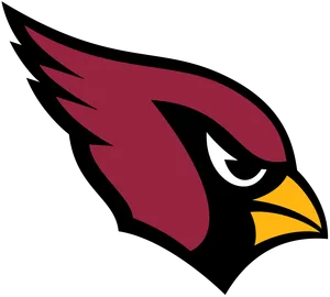
Arizona Cardinals
That determined, strutting cardinal head has real character to it, like it's about to say something. Simple color palette, strong silhouette, no clutter.
About Arizona Cardinals
One of the oldest franchises in the NFL, the Cardinals feature a strutting red cardinal head logo and are based in Glendale, Arizona.
- Founded
- 1898
- Logo colors
- Cardinal red, black, white
Kansas City Chiefs
The arrowhead is simple almost to a fault, but that simplicity is the point. Red and gold, clean lines, instantly recognizable on any jersey or helmet.
About Kansas City Chiefs
The Chiefs' arrowhead logo has stayed largely unchanged since the franchise's early years in the American Football League.
- Founded
- 1960
- Logo colors
- Red and gold
San Francisco 49ers
The interlocking SF is understated but has aged beautifully. Doesn't try too hard, which is exactly why it still looks sharp decades later.
About San Francisco 49ers
The 49ers' interlocking SF logo nods to the city's gold rush nickname and has remained one of the more understated marks in the league.
- Founded
- 1946
- Logo colors
- Red and gold
Minnesota Vikings
A horned, mustached Norseman in profile, it's got personality and menace without going cartoonish. One of the better mascot-head logos in the league.
About Minnesota Vikings
The Vikings' horned Norseman head logo has been a franchise staple since the team's founding, with only minor tweaks over the decades.
- Founded
- 1961
- Logo colors
- Purple, gold, white
BB Tier: Solid, dependable, a little safe
Buffalo Bills
The charging blue buffalo with the red stripe is solid and clean, if a little simple. Does its job without ever quite becoming iconic.
About Buffalo Bills
The Bills' charging buffalo logo, rendered in blue with a red accent stripe, has represented the franchise since a 1970s redesign.
- Founded
- 1960
- Logo colors
- Royal blue, red, white
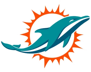
Miami Dolphins
The current leaping dolphin is sleeker and more modern than the sunset-and-dolphin version from decades past, though some longtime fans still miss the retro look.
About Miami Dolphins
The Dolphins updated their logo in 2013, moving from a dolphin leaping in front of a sunset to a sleeker standalone dolphin mark.
- Founded
- 1966
- Logo redesigned
- 2013
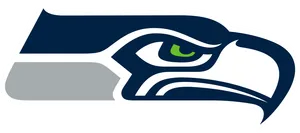
Seattle Seahawks
A stylized hawk head inspired by Pacific Northwest Indigenous art, bold and angular. Divisive among fans, some love the sharp abstraction, others find it a bit busy.
About Seattle Seahawks
The Seahawks' hawk head logo draws inspiration from Pacific Northwest Indigenous art traditions and was updated in the late 2000s.
- Founded
- 1976
- Logo colors
- Action green, navy, gray
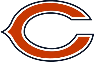
Chicago Bears
The wishbone C is clean and classic, if a little plain next to flashier logos. Honestly works better as a helmet mark than a standalone logo.
About Chicago Bears
The Bears' wishbone C logo has remained essentially the same for decades, representing one of the NFL's founding franchises.
- Founded
- 1919
- Logo colors
- Navy and orange
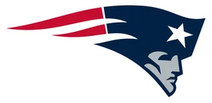
New England Patriots
Flying Elvis gets mocked constantly, but it's grown on people over three decades and a pile of Super Bowl rings. Better than the old minuteman mid-hike, if less charming.
About New England Patriots
Nicknamed 'Flying Elvis,' the Patriots' current patriot-head logo replaced the Pat Patriot minuteman mascot in the early 1990s.
- Founded
- 1960
Indianapolis Colts
A horseshoe. Simple, clean, a little boring. It works because it doesn't try to be anything more than what it is.
About Indianapolis Colts
The Colts' horseshoe logo dates back to the franchise's Baltimore origins and has stayed one of the simplest marks in the league.
- Founded
- 1953
- Logo colors
- Royal blue
Los Angeles Rams
The curled ram horn on the helmet is a genuine classic shape, but the standalone logo has been fussed with so many times over the years it's lost some of its punch.
About Los Angeles Rams
Known for the curled ram horns on their helmet, one of the first helmet logos in NFL history, the Rams have tweaked their standalone logo multiple times since moving between Los Angeles and St. Louis.
- Founded
- 1936
- Logo colors
- Blue and gold
New Orleans Saints
The fleur-de-lis is gorgeous as a civic symbol and ties perfectly to the city, even if as a football logo it's more elegant than fierce.
About New Orleans Saints
The Saints' fleur-de-lis logo ties directly to New Orleans' French colonial heritage and civic imagery.
- Founded
- 1967
- Logo colors
- Old gold and black
Detroit Lions
The leaping lion silhouette is clean and well balanced. Not flashy, but it reads instantly and never looks dated.
About Detroit Lions
The Lions' leaping lion silhouette has represented the franchise since the team's founding, with modern tweaks for sharper detailing.
- Founded
- 1930
- Logo colors
- Honolulu blue and silver
Atlanta Falcons
A sharp, angular falcon in flight that's aged well since its 90s redesign. Reads more like an abstract A than a bird at a glance, which is either a bug or a feature depending who you ask.
About Atlanta Falcons
The Falcons redesigned their logo in the 1990s into a sharper, more angular falcon in flight.
- Founded
- 1965
- Logo colors
- Red, black, silver
CC Tier: Gets the job done, barely
New York Jets
Just the word 'Jets' in a stacked, slightly retro font. Fine as a wordmark, forgettable as a logo. Feels like it's missing a symbol entirely.
About New York Jets
The Jets use a stacked wordmark logo rather than a symbol or mascot, a design choice that's stayed mostly consistent since a 1998 refresh.
- Founded
- 1960
- Logo colors
- Green and white
New York Giants
The interlocking NY is clean but shares real estate with the Yankees logo in most people's heads, which hurts its standalone identity.
About New York Giants
The Giants' interlocking NY logo is similar in style to other New York sports teams' marks, representing one of the league's oldest franchises.
- Founded
- 1925
- Logo colors
- Blue, red, white
Tennessee Titans
A blue tri-star circle with a flame off to the side, it reads more like a generic corporate mark than a football team. Technically sound, emotionally flat.
About Tennessee Titans
The Titans' logo features a blue circle with a tri-star pattern and a flame-like sword accent, introduced when the franchise rebranded from the Houston Oilers.
- Founded
- 1960
- Rebranded as Titans
- 1999
Washington Commanders
The new W-shield-feather mark is clean enough but still feels like a placeholder years after the name change. Nobody's mad at it, nobody loves it either.
About Washington Commanders
The Commanders introduced a new W-and-feather logo after the franchise's name change, replacing the previous Washington Football Team branding.
- Renamed Commanders
- 2022
- Logo colors
- Burgundy and gold
Cincinnati Bengals
The tiger-stripe B gets points for matching the uniforms so well, but as a standalone mark it's more pattern than symbol.
About Cincinnati Bengals
The Bengals' tiger-stripe B logo matches the team's distinctive striped helmet and uniform design.
- Founded
- 1968
- Logo colors
- Black and orange
Los Angeles Chargers
The lightning bolt is genuinely great, but the current logo leans so heavily on gradients and thin lines it loses punch at small sizes. The old bolt had more guts.
About Los Angeles Chargers
The Chargers' lightning bolt logo has gone through several versions, with the current design using thinner lines and gradient shading.
- Founded
- 1960
- Logo colors
- Powder blue, yellow, white
Cleveland Browns
The Browns logo is just a helmet, no face mask logo, nothing else on it. It is honest and simple but it reads more like a placeholder than a finished mark. Solid brand recognition keeps it out of the bottom tiers, but there is not much design to actually judge.
DD Tier: Needs real work
Houston Texans
The bull-horn 'Toro' mark is trying to combine a Texas flag star with a bull, and it ends up looking like neither one clearly. Serviceable, not memorable.
About Houston Texans
The Texans' 'Toro' logo combines a bull's horns with a star shape referencing the Texas flag.
- Founded
- 2002
- Logo colors
- Deep steel blue, battle red
FF Tier: Somebody please fix this
Jacksonville Jaguars
The snarling jaguar head looks more startled than fierce, and the proportions have always felt slightly off. One of the few logos in the league that fans actively campaign to redesign.
About Jacksonville Jaguars
The Jaguars updated their jaguar head logo in 2013 to a sharper, more detailed design, though it remains one of the more criticized marks in the league.
- Founded
- 1995
- Logo redesigned
- 2013
How we ranked them
We judged each logo on design quality (clean lines, good use of negative space, timelessness), identity (does it actually look like the team and city it represents), and cultural weight (has it become a genuine symbol people recognize instantly). Overdesigned logos, generic shields, and anything that looks like clip art got marked down. We leaned on broad fan and design-community consensus, then made our own calls where opinions split.
Think we got it wrong?
Drag all 32 nfl team logos into your own tier list, then download the image or share a link.
Rank these yourselfFAQ
What is the best NFL team logo?
By broad fan and design consensus, the Pittsburgh Steelers' Steelmark, the Green Bay Packers' G, and the Dallas Cowboys' star are usually at the very top.
What is considered the worst NFL team logo?
The Jacksonville Jaguars' jaguar head is the one most often singled out by fans and designers as due for a redesign.
Why do the Raiders have a pirate on their helmet?
The Raiders' logo combines a shield, crossed swords and a pirate wearing a football helmet, a design meant to evoke a rebellious, swashbuckling attitude that's matched the team's identity since the franchise's early days.
Has the Washington Commanders logo changed recently?
Yes, the franchise introduced a new W-and-feather logo after rebranding from the Washington Football Team name, and it's still fairly new compared to the rest of the league's marks.
Which team has the simplest logo in the NFL?
The Green Bay Packers (a single letter G) and the Indianapolis Colts (a horseshoe) are among the simplest, stripped-down marks in the league.
From the blog
More rankings
Image credits
- Pittsburgh SteelersLogo: Brighterorange, Public domain (Wikimedia Commons) · Source
- Green Bay PackersLogo: This vector image was created with Adobe Illustrator by Daris Bayliss, and then manually edited by Green Bay Packers., Public domain (Wikimedia Commons) · Source
- Dallas CowboysLogo: Opertinicy, Public domain (Wikimedia Commons) · Source
- Las Vegas RaidersLogo: Wikipedia · Source
- Philadelphia EaglesLogo: Wikipedia · Source
- Denver BroncosLogo: Wikipedia · Source
- Tampa Bay BuccaneersLogo: Wikipedia · Source
- Baltimore RavensLogo: Wikipedia · Source
- Carolina PanthersLogo: Wikipedia · Source
- Arizona CardinalsLogo: Wikipedia · Source
- Kansas City ChiefsLogo: Kansas City Chiefs, Public domain (Wikimedia Commons) · Source
- San Francisco 49ersLogo: San Francisco 49ers, User:Stepshep, Public domain (Wikimedia Commons) · Source
- Minnesota VikingsLogo: Wikipedia · Source
- Buffalo BillsLogo: Wikipedia · Source
- Miami DolphinsLogo: Wikipedia · Source
- Seattle SeahawksLogo: Wikipedia · Source
- Chicago BearsLogo: Chicago Bears, © NFL (Wikimedia Commons) · Source
- New England PatriotsLogo: Wikipedia · Source
- Indianapolis ColtsLogo: Indianapolis Colts, Public domain (Wikimedia Commons) · Source
- Los Angeles RamsLogo: Wikipedia · Source
- New Orleans SaintsLogo: New Orleans Saints, Public domain (Wikimedia Commons) · Source
- Detroit LionsLogo: Wikipedia · Source
- Atlanta FalconsLogo: Wikipedia · Source
- New York JetsLogo: New York Jets, Public domain (Wikimedia Commons) · Source
- New York GiantsLogo: Opertinicy at en.wikipedia, Public domain (Wikimedia Commons) · Source
- Tennessee TitansLogo: Wikipedia · Source
- Washington CommandersLogo: Washington Commanders, Public domain (Wikimedia Commons) · Source
- Cincinnati BengalsLogo: Cincinnati Bengals, Public domain (Wikimedia Commons) · Source
- Los Angeles ChargersLogo: Los Angeles Chargers, Public domain (Wikimedia Commons) · Source
- Houston TexansLogo: Wikipedia · Source
- Jacksonville JaguarsLogo: Wikipedia · Source
- Cleveland BrownsLogo: Wikipedia · Source