




NBA Team Logos Tier List: Every Franchise Ranked
Thirty teams, thirty logos, and roughly thirty different opinions on each one. We went through every current NBA logo, from the simple to the overstuffed, and sorted them by how well they actually work as logos: memorable silhouette, good colors, something you'd want on a hat.
This isn't about which team is good right now. It's about the mark itself, the shape you'd recognize from across a parking lot. Fans argue about this stuff constantly, so where the consensus splits, we picked a side and told you why. Disagree? That's half the fun of a list like this.
The tier list
The community’s tier list fills in as members vote. It appears once 5 members have ranked or voted on these.
Think you can rank them better?
Make your own tier listFree account. Your ranking stays private unless you share it, and it counts toward the community tier list.Vote
SS Tier: The gold standard
Los Angeles Lakers
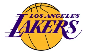
That purple and gold swinging basketball has been around since the 70s in one form or another, and it still looks sharp. Simple, confident, and it means something the second you see it on a car window sticker.
About Los Angeles Lakers
Originally the Minneapolis Lakers before relocating to Los Angeles in 1960, the franchise is one of the most decorated in NBA history. The purple-and-gold basketball logo has been a franchise staple since the 1970s.
- Relocated to LA
- 1960
- Logo colors
- Purple, gold
Chicago Bulls
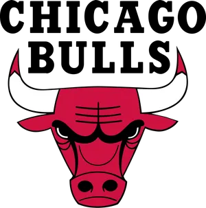
Possibly the best sports logo in America, not just the NBA. The snarling red bull head is aggressive without being cartoonish, works in black and white, and hasn't needed a redesign in decades because it never needed one.
About Chicago Bulls
Founded in 1966, the Bulls play in Chicago and are best known for the Michael Jordan championship teams of the 1990s. Their red bull head logo has stayed essentially unchanged since the franchise's early years.
- Founded
- 1966
- Logo colors
- Red, black, white
Boston Celtics
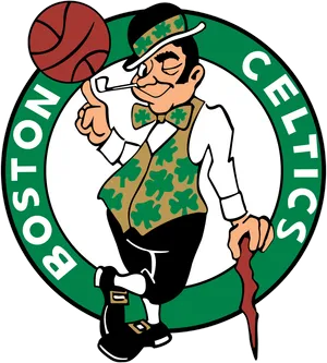
Lucky the leprechaun spinning a ball on his finger shouldn't work as well as it does, but it's dripping with history. Green, gold, and that pipe is basically a trademark of winning.
About Boston Celtics
One of the NBA's original franchises, based in Boston since the league's founding era. The leprechaun logo, nicknamed Lucky, has represented the team for decades.
- Logo colors
- Green, white, gold
AA Tier: Excellent and instantly recognizable
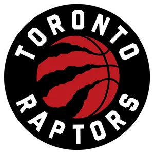
Toronto Raptors
The modern ball-with-claw mark is a huge upgrade over the old cartoon dinosaur, and it still nods to the team's identity without looking like a kids' show. Purple and red together shouldn't work but it does.
About Toronto Raptors
The Raptors logo originally featured a cartoonish dinosaur dribbling a basketball, later evolving into a sleeker, more aggressive raptor claw design. The team is Canada's NBA franchise and has used purple and red color schemes across its branding history.
- City
- Toronto, Ontario, Canada
- Founded
- 1995
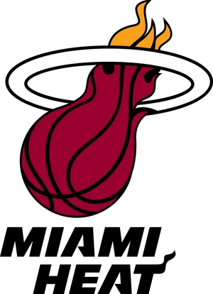
Miami Heat
That flaming basketball over the word HEAT is about as clean as wordmark logos get. Red, black, and yellow, instantly readable from the nosebleeds.
About Miami Heat
The Heat logo features a basketball engulfed in flames, representing the team's name and the warm climate of Miami. The design uses red, black, and yellow to convey intensity and energy.
- City
- Miami, Florida
- Colors
- Red, black, yellow
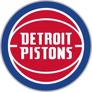
Detroit Pistons
The current horse-head-in-a-basketball mark is a sleeper hit, red white and blue done right, with just enough edge to feel like a team and not a car dealership.
About Detroit Pistons
NBA franchise based in Detroit, Michigan, playing in the Eastern Conference. The current logo features a red, blue and white design built around a horse head silhouette, reflecting the city's automotive heritage.
- Founded
- 1941
- Conference
- Eastern
- Logo colors
- Red, blue, white
- Logo motif
- Horse head
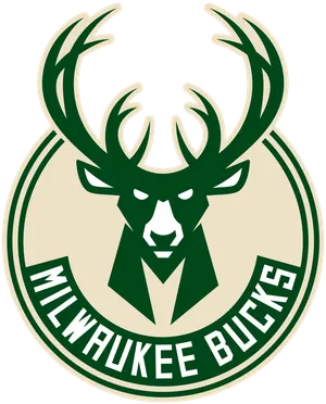
Milwaukee Bucks
The 2015 rebrand nailed it: a sleek deer head with antlers that fits inside the shape of a basketball seam. Cream and green is a weirdly good combo too.
About Milwaukee Bucks
The Bucks logo has featured a deer or buck head design across various eras, with a notable modern redesign introducing a bold, angular deer silhouette in green and cream colors. The rebrand coincided with the team's renewed on-court success in the 2010s.
- City
- Milwaukee, Wisconsin
- Symbol
- Buck (deer)
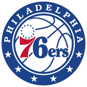
Philadelphia 76ers
The star-and-stripes shield leans into American history without feeling like a bicentennial leftover. Red, white, and blue, straightforward, and it ties directly to the city's identity.
About Philadelphia 76ers
The 76ers logo references the American Revolutionary War era and the city's historic significance, incorporating stars and stripes imagery tied to the number 76 (1776). The team has used variations of a star-and-stripes motif throughout its branding.
- City
- Philadelphia, Pennsylvania
- Name origin
- 1776, American independence
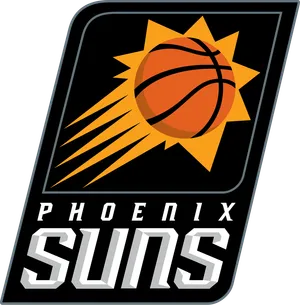
Phoenix Suns
The current sun-ball mark with the orange and purple gradient is bold and modern, and the basketball-as-sun idea is about as literal and effective as logo design gets.
About Phoenix Suns
The Suns logo has featured a basketball with a sun design, with an orange and purple color scheme that became iconic in the 1990s. The team updated to a more modern sun-ball logo in the 2010s and later refreshed its branding again.
- City
- Phoenix, Arizona
- Colors
- Orange and purple
BB Tier: Solid, no complaints
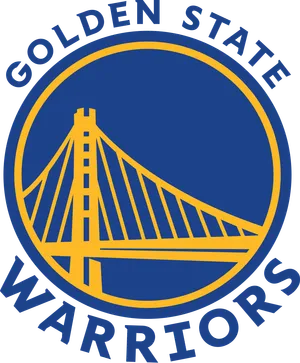
Golden State Warriors
The Bay Bridge logo is a nice bit of local flavor, but it's gone through so many versions over the years that it doesn't have the single iconic image some of these other teams do.
About Golden State Warriors
The Warriors logo has gone through several versions, including a notable Bay Bridge design referencing the San Francisco Bay Area. The team has also used a logo featuring the Golden Gate Bridge in more recent branding.
- City
- San Francisco, California
- Landmark
- Bay Bridge/Golden Gate Bridge
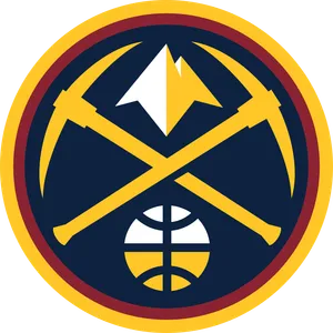
Denver Nuggets
The mountain skyline logo is colorful and genuinely represents the city, snow-capped peaks and all. It's busy compared to the top tier but it's grown on people.
About Denver Nuggets
NBA franchise based in Denver, Colorado, playing in the Western Conference. Their modern logo uses a mountain skyline motif in blue, yellow and a rainbow-accented design inspired by their classic 1980s look.
- Founded
- 1967
- Conference
- Western
- Logo motif
- Mountain skyline
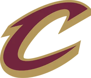
Cleveland Cavaliers
The current wine-and-gold sword-and-basketball mark is clean and professional. It lacks a bit of personality but it does its job without embarrassing anyone.
About Cleveland Cavaliers
NBA franchise based in Cleveland, Ohio, playing in the Eastern Conference. The team's logo has gone through several redesigns, including a sword-themed wordmark and a modern wine and gold emblem featuring a stylized 'C' and basketball.
- Founded
- 1970
- Conference
- Eastern
- Logo colors
- Wine, gold, navy
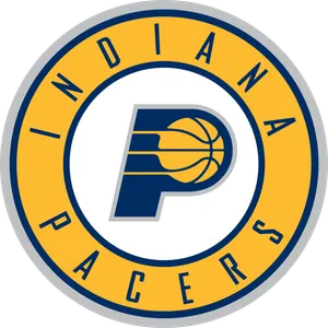
Indiana Pacers
Simple pinwheel-style basketball mark in blue, gold and red. Doesn't scream for attention but it's aged fine and reads well on a jersey.
About Indiana Pacers
The Pacers logo features a basketball with a streak design, referencing the pace cars of the Indianapolis 500, a nod to the state's racing heritage. The team has used blue, gold, and yellow in its branding.
- City
- Indianapolis, Indiana
- Name origin
- Indianapolis 500 pace cars
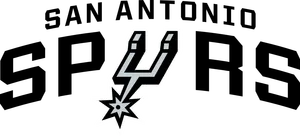
San Antonio Spurs
Black, silver and a basketball with a spur rowel worked into it. It's restrained almost to a fault, but restraint has its own kind of class.
About San Antonio Spurs
The Spurs logo features a stylized spur wheel design with silver and black colors, reflecting the team's Texas roots and ranching heritage. The current logo design has remained largely consistent with minor refinements over the years.
- City
- San Antonio, Texas
- Colors
- Silver and black
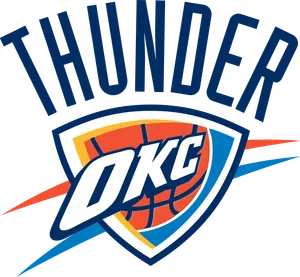
Oklahoma City Thunder
A basketball splitting into a lightning-bolt shaped shield in blue and orange. Not flashy, but it fits a team whose whole brand is quiet efficiency.
About Oklahoma City Thunder
The Thunder logo features a shield design with a basketball and lightning-like elements, symbolizing the team's name. The franchise relocated to Oklahoma City from Seattle, where it was previously known as the SuperSonics.
- City
- Oklahoma City, Oklahoma
- Relocated from
- Seattle
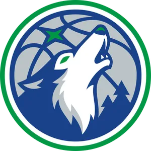
Minnesota Timberwolves
The current wolf-head mark is a solid piece of design, moody blues and a sharp wolf profile, even if it doesn't quite reach the howling-wolf nostalgia of the old one.
About Minnesota Timberwolves
The Timberwolves logo features a howling wolf design, reflecting the forested, wolf-populated regions of Minnesota. The team has updated its logo over the years while keeping the wolf as its central emblem.
- City
- Minneapolis, Minnesota
- Symbol
- Wolf
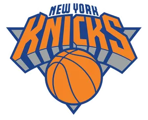
New York Knicks
The basketball-in-an-orange-circle with KNICKS across it is honestly a little plain for a franchise this big, but the blue and orange combo carries it.
About New York Knicks
The Knicks logo features a basketball with the team name in blue and orange, colors tied to the New York City flag. The logo design has remained relatively consistent, emphasizing the franchise's long history as one of the NBA's original teams.
- City
- New York City, New York
- Colors
- Blue and orange
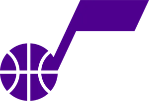
Utah Jazz
The mountain-and-basketball logo is a real improvement over the brief note-themed era, and it finally gives the team a visual identity that matches where they actually play.
About Utah Jazz
The Jazz logo has gone through several distinct eras, from the original musical note design brought from New Orleans to the mountain-themed logo of the 1990s and 2000s, back to a modern take on the original jazz note style. The team's identity reflects its unusual origin as a jazz-named franchise that relocated to a mountain state.
- City
- Salt Lake City, Utah
- Original city
- New Orleans
CC Tier: Fine, forgettable
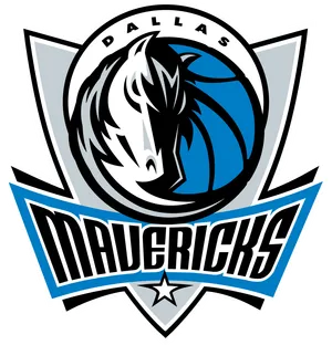
Dallas Mavericks
The horse-head mark is fine but forgettable, a bit generic compared to other animal-head logos in the league like Detroit's or Milwaukee's.
About Dallas Mavericks
NBA franchise based in Dallas, Texas, playing in the Western Conference. The team's logo features a stylized horse head in navy blue and silver, evoking the Texan 'maverick' spirit.
- Founded
- 1980
- Conference
- Western
- Logo colors
- Navy blue, silver
- Logo motif
- Horse head
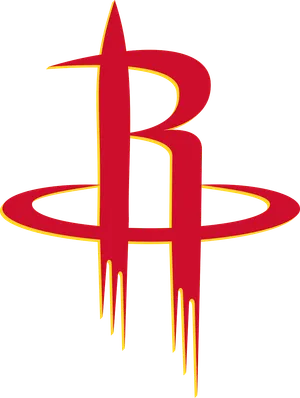
Houston Rockets
Red and white with a basketball streaking like a comet. It's perfectly serviceable but it doesn't leave much of an impression once you look away.
About Houston Rockets
The Rockets logo has featured a basketball with a trailing rocket-like design, referencing Houston's association with NASA and space exploration. The team updated its logo in the mid-1990s to a more streamlined, modern look.
- City
- Houston, Texas
- Theme
- Space/NASA
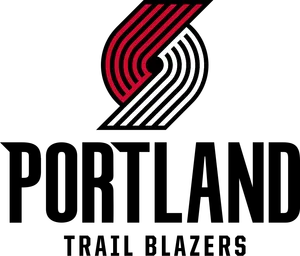
Portland Trail Blazers
The red pinwheel logo is clean and has history, but on its own, without the city name attached, almost nobody could identify it cold.
About Portland Trail Blazers
The Trail Blazers logo features a stylized pinwheel-like design of interlocking "p" shapes forming a circular pattern, representing a basketball and the spirit of trailblazing. The logo has remained one of the more recognizable and abstract designs in the league.
- City
- Portland, Oregon
- Design
- Interlocking pinwheel pattern
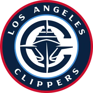
Los Angeles Clippers
A basketball with a wordmark slash through it. Functional, inoffensive, and about as exciting as the word 'functional' implies.
About Los Angeles Clippers
The Clippers logo has featured a basketball design with the team name, historically referencing sailing ships (clippers) tied to the franchise's original San Diego home near the harbor. The team has undergone several rebrands, including a modern redesign in recent years.
- City
- Los Angeles, California
- Original city
- San Diego
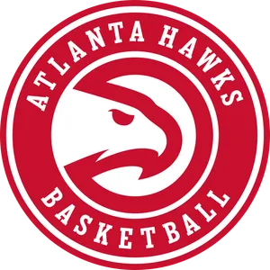
Atlanta Hawks
The hawk-head mark is decent but has been tweaked so many times it never quite settled into something iconic the way Chicago's bull did.
About Atlanta Hawks
NBA franchise based in Atlanta, Georgia, playing in the Eastern Conference. Known for its leaping hawk logo, the team has used various versions of the bird emblem throughout its history in red, yellow and black.
- Founded
- 1946
- Conference
- Eastern
- Logo colors
- Red, yellow, black
- Logo motif
- Hawk
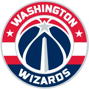
Washington Wizards
A basketball with a wizard's wand and stars. It's trying to look mystical and ends up looking like an avatar from a flash game, though it's harmless enough.
About Washington Wizards
The Wizards logo features a basketball with stars and the team name in a bold, patriotic color scheme reflecting the team's Washington D.C. home. The franchise rebranded from the Bullets to the Wizards in the mid-1990s, adopting a new logo identity at that time.
- Colors
- Red, white, blue
- City
- Washington, D.C.
- Name change
- Bullets to Wizards
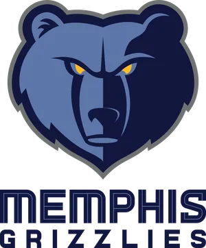
Memphis Grizzlies
The bear-paw-print mark reads fine but lacks the punch of a full animal head, it feels like half a logo next to Detroit's horse or Chicago's bull.
About Memphis Grizzlies
The Grizzlies logo features a bear design, reflecting the team's name, and has evolved from a cartoonish style to a more fierce, modern bear head emblem. The franchise relocated to Memphis from Vancouver.
- City
- Memphis, Tennessee
- Relocated from
- Vancouver
DD Tier: Needs a redesign
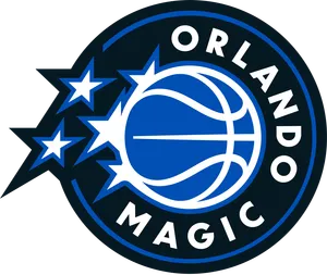
Orlando Magic
A basketball with a star trail streaking off it. It's meant to feel magical and instead feels like clip art from a theme park gift shop.
About Orlando Magic
The Magic logo features a basketball with a sparkling star trail, evoking a magical, whimsical feel tied to Orlando's association with Walt Disney World. The team's color scheme has included blue, black, and silver across different eras.
- City
- Orlando, Florida
- Founded
- 1989
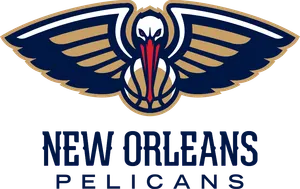
New Orleans Pelicans
The pelican dunking a basketball is a fun idea on paper, but the execution is cluttered and the colors (navy, red, gold) don't quite land together.
About New Orleans Pelicans
The Pelicans logo features a pelican holding a basketball, referencing Louisiana's state bird. The team rebranded from the Hornets to the Pelicans in 2013, adopting a new color scheme of navy, red, and gold.
- City
- New Orleans, Louisiana
- Rebranded
- 2013
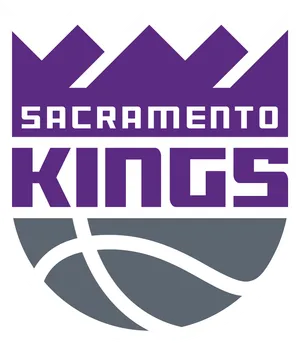
Sacramento Kings
A purple crown over a basketball. It's about as literal as logos get, and not in the good way like Phoenix, it just feels like a placeholder.
About Sacramento Kings
The Kings logo has incorporated crown imagery throughout its history, symbolizing royalty in line with the team's name. The franchise has had several logo redesigns since relocating to Sacramento.
- City
- Sacramento, California
- Symbol
- Crown
FF Tier: Please start over
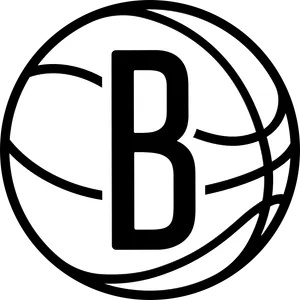
Brooklyn Nets
A plain black and white wordmark with no imagery at all. Minimalism can work, but this just looks unfinished, like the real logo never got delivered.
About Brooklyn Nets
The franchise moved from New Jersey to Brooklyn in 2012 and adopted a stripped-down black and white wordmark logo as part of the rebrand.
- Moved to Brooklyn
- 2012
- Logo colors
- Black, white
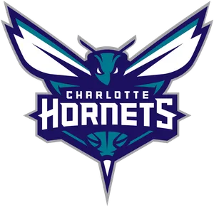
Charlotte Hornets
The hornet mascot mark is busy, dated, and the purple-teal-black combo feels stuck in the 90s it's trying to recreate. A downgrade from how sharp the original Hornets branding used to be.
About Charlotte Hornets
The Hornets name and branding returned to Charlotte in 2014 after the franchise had spent years as the Bobcats, bringing back the purple and teal color scheme from the original 1988 Hornets.
- Name returned
- 2014
- Logo colors
- Purple, teal, black
How we ranked them
We judged each logo on recognizability (can you ID it in half a second), design quality (color, balance, how it holds up small on a jersey or large on a wall), originality, and how well it fits the team's city or history. We leaned on what fans and design critics tend to agree on across forums and reviews, then made our own call on the close ones. Nostalgia counts for something. So does looking good on a t-shirt.
Think we got it wrong?
Drag all 30 nba team logos into your own tier list, then download the image or share a link.
Rank these yourselfFAQ
What's generally considered the best NBA logo?
The Chicago Bulls logo is the most commonly cited pick, with the Lakers and Celtics marks close behind for sheer recognizability and history.
Which NBA logo do fans criticize the most?
The Brooklyn Nets wordmark gets the most pushback for having no imagery at all, and the Charlotte Hornets logo is often called dated and overly busy.
Has the Minnesota Timberwolves logo changed recently?
Yes, the team moved to a new wolf-head design, replacing the howling wolf silhouette fans associate with the 1990s era.
Why do some fans like simple logos better?
Simple shapes like the Bulls' bull head or the Pistons' horse-in-a-basketball read better at small sizes, on jerseys, and from a distance, which is why design critics tend to rank them higher.
Is this ranking about design or team performance?
Purely design. A team's record on the court has nothing to do with where its logo lands on this list.
More rankings
Image credits
- Los Angeles LakersLogo: The original uploader was Tkgd2007 at English Wikipedia., Public domain (Wikimedia Commons) · Source
- Chicago BullsLogo: Dean Perry Wessel (1920-2004) or Ted Drake (1927-2000), Public domain (Wikimedia Commons) · Source
- Boston CelticsLogo: Wikipedia · Source
- Toronto RaptorsLogo: Wikipedia · Source
- Miami HeatLogo: Wikipedia · Source
- Detroit PistonsLogo: Unknown authorUnknown author, Public domain (Wikimedia Commons) · Source
- Milwaukee BucksLogo: Wikipedia · Source
- Philadelphia 76ersLogo: Wikipedia · Source
- Phoenix SunsLogo: Wikipedia · Source
- Golden State WarriorsLogo: Wikipedia · Source
- Denver NuggetsLogo: Wikipedia · Source
- Cleveland CavaliersLogo: Cleveland Cavaliers. The original uploader was Gus Polly at English Wikipedia.. Later version(s) were uploaded by EurekaLott, DatBot, Charlesaaronthompson, Corkythehornetfan, Banan14kab, Sabbatino at , Public domain (Wikimedia Commons) · Source
- Indiana PacersLogo: Wikipedia · Source
- San Antonio SpursLogo: Wikipedia · Source
- Oklahoma City ThunderLogo: Wikipedia · Source
- Minnesota TimberwolvesLogo: Wikipedia · Source
- New York KnicksLogo: Wikipedia · Source
- Utah JazzLogo: Wikipedia · Source
- Dallas MavericksLogo: Wikipedia · Source
- Houston RocketsLogo: Wikipedia · Source
- Portland Trail BlazersLogo: Wikipedia · Source
- Los Angeles ClippersLogo: Wikipedia · Source
- Atlanta HawksLogo: Wikipedia · Source
- Washington WizardsLogo: Wikipedia · Source
- Memphis GrizzliesLogo: Wikipedia · Source
- Orlando MagicLogo: Wikipedia · Source
- New Orleans PelicansLogo: Wikipedia · Source
- Sacramento KingsLogo: Wikipedia · Source
- Brooklyn NetsLogo: Wikipedia · Source
- Charlotte HornetsLogo: Wikipedia · Source